Character Jam à la Barry
Was trying to pull off one of Lynda Barry’s class exercises on my own, but it was tricky. Spent an evening hacking together a substitute for friends so I could do a solo “Character Jam”.
MoreWas trying to pull off one of Lynda Barry’s class exercises on my own, but it was tricky. Spent an evening hacking together a substitute for friends so I could do a solo “Character Jam”.
MoreThis splendid cover by Maurice Tillieux caught my attention this morning. I admire that drawing style a lot, but had never really heard of Tillieux before, so I started wondering why the styles of so many Belgian cartoonists are so similar, did they all go to the same art school or something? (And do they offer classes? 🙏)
Some quick googling led me to The Marcinelle School (as in “school of thought”, not “a place to study”), named after the site of the Dupuis printing firm who published Le Journal de Spirou. The Comics Journal has written a great piece about The Belgians Who Changed Comics, including magazine rivalry and where this style comes from:
The team's cartooning technique – partly inherited but soon individualised – was an animated, breezy, ultra-modern one. Eventually, it became known as 'le style atome'. This moniker derived from the 1958 Brussels World's Fair, whose signature was a sculpture called 'the Atomium'. An outsized icon of Populuxe design, this seemed to match the sparky visual spirit of post-War Spirou. Certainly it paralleled the artists' angular shapes, their streamlined drawings and a use of bright, sharp colours. Graphically much brasher than Hergé's ligne claire, le style atome gave a nod to '50s and '60s US culture. It featured rounder speech bubbles instead of rectangles and privileged short, spunky dialogue over declamations.
[...]
Spirou's energetic art is now known as "the Marcinelle school" or "the school of Charleroi". Both terms refer to the site of the Dupuis' printing firm. But those artists who worked with Jijé had a different name for it. They called the work gros nez – or "big nose" – comedy.
The flipside of Marcinelle art was found in the pages of Tintin. A vehicle for Hergé's hero, this weekly was the laboratory of a rival "Brussels' school". Just as Marcinelle art reflected Jijé’s temperament, the Tintin employees operated in Hergé's shadow. Their highly polished work was required to resemble his and, in their atelier, an artist wore his suit and tie. He would labour to produce pristine pages, with refined lines underscored by un-shaded colour.
It also has this quote about Franquin’s amazing line style:
Inside the frames, everything is concrete, everything is charged with the energy of the line. The speech bubbles, the paper lying around on the floor, the exclamation points…nothing can be inanimate; everything has to come alive. Fantasio's anger is more than simply buggy eyes, dishevelled hair and a wide, gaping mouth. It's also puffs of cloud around him, lines that tremble like forceful cries and the tail of a speech balloon turned into a zigzag of lightning. There are so many graphic incarnations of the intangible, of invisible and interior moods… it makes metaphysical anguish absolutely palpable.
Check out the linework in these old, felt-cled postcards!
The best part of working on this series is how time disappears. I don’t know where it is I go when I’m using the brush, but at some point I come back and there is a little painting.
One of the most mysterious things about drawing fast is how the drawings accumulate some kind of aliveness that I can’t recognize at all when I’m making them. None of these drawings made me happy or satisfied me while I was making them. But later they made me laugh. Especially the ones I’d thought were ‘failures’. Those are the ones that seem the most alive to me later. I was writing to someone about it. Saying that these are the ones that are impossible to do on purpose and impossible to really copy. The spontaneous gesture is in the line. That third place.
I could never adjust to the “half-up” (150%) scale at which mainstream comics had to be drawn. I preferred to work twice up and that wasn’t an option.
[...]
I often photocopy a sketched frame, reducing or enlarging it to a size I think more pleasing, and then tape it back on the tracing paper, which looks like a patchwork quilt by the time I’m finished.
Draw ten five minute cats. Use a timer. Don’t stop. In less than an hour you will get to know some cat that starts showing up under your brush. No by willful effort, but by some sort of being together over a period of time. A drawing of a cat can be that, a being together with the image you make of the cat and then five minutes later you can draw the same cat to see what it is up to. Maybe it’s in the same position, maybe it has gone to sleep. But I like to imagine this place where the cat is being itself and I can somehow pull up pictures from that place onto the paper. It becomes a kind of conjuring. And ordinary superpower.
...Drucker’s art partakes in the most venerable MAD tradition of all: the “chicken fat” aesthetic, the stuffing of panels with sight gags and visual digressions pioneered by Harvey Kurtzman and Will Elder (and defined by Elder as the inessential “parts of the strip that gave it more flavor,” as chicken fat gave more flavor to his mother’s soup, “but did very little to advance the storyline”).
I don’t mind drawing with digital tools, but I have no idea how they work so there’s a distance between me and the drawing.
With ink pens there’s a direct connection to the page, and knowing how tools work makes drawing with them an intimate experience.
It’s hard to reassure someone young that they’ll one day be completely sick of “their style”, that they’ll be working overtime to unlearn all their habits and tics that make it up. I try to switch up how I draw things from project to project pretty dramatically. Something inspiring to me about Wendy is how elastic her design is, though. I was aiming for something similarly elastic when I drew Brat and Stunt, or a few of my shorts. That seems like a good way out of feeling too locked in to any one style or design choice, to draw characters and create worlds you can kind of contort however you need.
Inside the frames, everything is concrete, everything is charged with the energy of the line. The speech bubbles, the paper lying around on the floor, the exclamation points…nothing can be inanimate; everything has to come alive. Fantasio's anger is more than simply buggy eyes, dishevelled hair and a wide, gaping mouth. It's also puffs of cloud around him, lines that tremble like forceful cries and the tail of a speech balloon turned into a zigzag of lightning. There are so many graphic incarnations of the intangible, of invisible and interior moods… it makes metaphysical anguish absolutely palpable.
Drawings are pleasing to look at because they're not photographs. They're a recording (an imperfect one) of how someone else sees the world and what they think is important based on what they choose to emphasize.
Making photocopies of our originals is quite instructional, because we get a clue as to how our work will look when reproduced and how to “size” our artwork by considering the final reproduction as we create our original. We may need to adjust and clarify our drawing if our lines do not reproduce as intended.
Avoid frills or unnecessary elaborate flourishes; simplify your range of gray tones. As Art Spiegelman wrote in Dead Dick, his Dick Tracy homage, “Never stipple when you can hatch. Better yet, use black.”
The first computer-aided rendering of a simulated black hole was made in 1979 by Jean-Pierre Luminet. Stunningly accurate and beautiful, it was made by feeding punch cards into an IBM 7040 mainframe computer and hand plotting the output with ink on negative image paper. (Engadget article)
“Hello students, meet Professor Skeletor. Be on time, don’t miss class, and turn off your phones. No time for introductions, we start drawing right away. The goal is more rock, less talk, and we communicate only through images.”
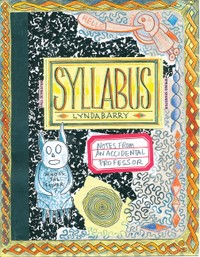
“Syllabus takes the course plan for Barry's workshop and runs wild with it in her densely detailed signature style. Collaged texts, ballpoint-pen doodles, and watercolor washes adorn Syllabus 's yellow lined pages, which offer advice on finding a creative voice and using memories to inspire the writing process. Throughout it all, Barry's voice (as an author and as a teacher-mentor) rings clear, inspiring, and honest.”